Bombed heavily in World War Two, 2,200 lives were lost in Birmingham. Centrally located and the most important manufacturing center in Britain. For me as a planner, it is THE laboratory for experimentation in design and pure economic, market-driven pragmatism.
Four expressions that were famous well before I arrived here: Spaghetti Junction, Shopping Complex, Eyesore and Brutalism. Birmingham has bravely stood as the textbook example for all four. I wanted to go and see if it's really as bad as they say it is. And if so, what are they doing about it?
 1. Spaghetti Junction.
 Birmingham is host to the original. The term was invented by a journalist in the 60s to describe the meeting of several roadways in Birmingham.
Specifically, "the Gravelly Hill Interchange on the M6 Motorway in Birmingham, United Kingdom."According to Wikipedia, "'Spaghetti Junction' is a nickname sometimes given to a complicated or massively intertwined road traffic interchangethat resembles a plate of spaghetti."
Since then many complex interchanges around the world have acquired the nickname, with nearly 20 in Los Angeles County alone. Others go by names like "Can of Worms," "Malfunction Junction," "Mixmaster Interchange," Even my own beloved I-405/I-5-Bellevue Way hot mess is listed under spaghetti junctions in Wikipedia. But this one in Birmingham is the bonafide original. Nice to put a face on it, I think.
2. Complex. Birmingham has a number of them. The Bull Ring. The Cube. The Mailbox. Brindleyplace. To name but a few within the City Centre.
 |
| The Mailbox |
"The 1960s Bull Ring Centre (however) had problems from the beginning and was very much a product of its era. At the time of its opening it was considered the height of modernity, but ... the public were less inclined to use the subways and escalators, which stopped working regularly. Also, it did not age well and soon became generally regarded as an unfortunate example of 1960s Brutalist Architecture, with its boxy grey concrete design and its isolation within ringroads connected only by pedestrian subways. It was, in later days, much disliked by the public and contributed to the popular conception that Birmingham was a concrete jungle of shopping centres and motorways.
The shopping centre's design has both its admirers and detractors. In 2008, a poll conducted in conjunction with SimCity creator stated that Bullring was the ugliest building in the country. (Wikipedia)
The Rotunda with it's Blade Runner-style Coca Cola advertising. The architect later explained that the building had originally been intended to look like a candle, with a flame-like weather beacon on top, changing colour to reflect the weather.
The Bullring dates back to the 12th and 13th centuries, where bulls were kept linked together for "baiting" before being slaughtered. The Bullring is the busiest shopping centre in the UK today. Here you can see St Martin's church, the back of New Street Station and the edge of Selfridge's (see closeups below).

Referred to in Wikipedia as "blobitecture, it won eight awards including the RIBA Architecture Award for 2004. It is clad in 15,000 shiny discs and is based on a design for a sequinned dress by Paco Rabanne.
 Like a supermodel it loves to be photographed from all different angles. It's interesting that I was here and I didn't even know it. It sits behind New Street Station and if you come out the other end of New Street you can ignore it completely. Never saw the infamous sequined Selfridge's, St. Martin's Church or the bull statue. I'm beginning to see a pattern: that hope for a future filled with curves and sunshine. Getting people where they're going efficiently. Tubes and wombs and everything almost anatomical--where does it come from? Shiny skins reflecting their surroundings.
It gets weirder. This is the "Parametric Bridge" connecting the store to its mother ship, the parking garage.
3. Eyesore. In November 2003 New Street Station in Birmingham was voted the second biggest "eyesore" in the UK by readers of Country Life magazine. Again, Wikipedia: " This might be blamed on the sub-surface nature of the station and the 1960s architecture."

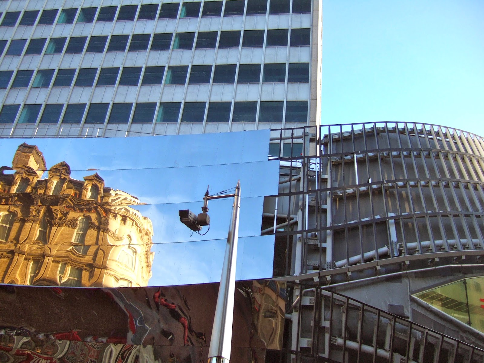
Here is what they're replacing it with--more blobitecture. Of course it doesn't look like this right away. At the moment it looks like this:


Yep, that's the work in progress that is New Street Station. An unblinking eyeball surrounded by mirrored panels. A lot of trains run through the midlands station of Birmingham, second largest city in England, the "narrow waistband in the hour clock" of all the train lines that connect north to south.


The first and last sight you see as you encounter Birmingham. From this angle you really see the unintended "dropped drawers" effect. Never mind.

This is what it will look like when it's finished. More of the swooping piles that have nothing to do with historic Birmingham and everything to do with what the future holds. Sigh.
4. Brutalism. The concrete style originating in France and referred to previously under "complex" I think its quite nice in that it's not trying to sell anything. I get it. The truth. Functional and sculptural when administered in small doses. Doesn't call attention to itself. Unfortunately, it is intensely hated in the most deep-seated and resentful way, and therefore in the process of being torn down (see my blog entry on the new Library of Birmingham)

Like anything else, it's fine til it gets neglected.
We'll leave on a hopeful note--a station full of humanity and sunlight. Is it just me or does it resemble a giant ribcage? Note to architects: Always photograph your buildings in plenty of sunlight--compare with brutalist library, above.
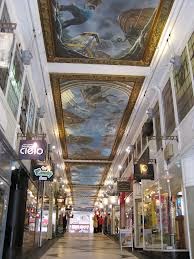
As you head out of the station you walk through this, Picadilly Arcade, where you must look up:
Isn't this amazing? It's just a small part of an entire arcade/passageway ceiling handpainted by Peter Maxfield and illustrating a fantastic narrative entitled "A Year in the Life of the Chinchillas" with all sorts of characters peering down at the people passing by.


